Showing posts with label color. Show all posts

Thursday, July 17, 2014

Color Journals: Daydreaming in blue for Gerry

Due to my vacation schedule, I haven't been able to attend my journal art meeting since April. I finally made it this Tuesday, with three projects that have been backlogged. I hope the delay wasn't too disruptive to the group. I'll put up separate posts for each.

My assignment for May was to make a page in blue plus a neutral for Gerry, who also selected a theme of Daydreaming. Traveling is what I daydream about, so I worked through the basic techniques in my newest book purchase Art Quilt Maps, to build a background layer of cottons, sheers, and a few interesting upholstery bits. I added some very faint neutral paint (I can't believe there's a color called "Metallic Taupe" -- reminds me of National Lampoon's Vacation), then started building a river, roads, fields, and houses. I used a nice combination of machine and hand stitching, glued on a few embellishments, and finally had some success with the sparkly Angelina fiber. I'll let the photos say the rest.
Inspiration and technique. I love this book.
Daydreaming -- full view
Daydreaming close-up. I thought this looked kind of like a cul-de-sac, but without the compass rose it was more like a big grey lollipop. I loved how the tiny squares -- cut from a Stonehenge print -- looked like houses on a development plan.  I wasn't replicating a specific map of any particular place, so I don't know what the rectangular bit is "supposed" to be; it's all rather abstract.
Daydreaming close-up. I love the gridded grey sheer on the right. I can envision using this on a bunch of other map projects. The hand stitched Xs were for some dimension and interest. I glued some brass caps onto this segment of the "houses."
I love how these circles above the river came out. Hand stitching and glued brass embellishments. I stitched down each wale of the white corduroy rectangle in the upper right corner.
Coming soon: Patti's orange page!

Monday, March 3, 2014

Color Journals: Green for Lynn

Last week our journal group finally managed to have a meeting on a snow-free Tuesday evening. I pulled out my tiny twister to make Lynn's segment. I was a little hesitant to commit to this idea, because it doesn't have any "deeper meaning" or philosophical statement, but she asked for green and white and this is what was speaking to me at the time. So, a miniature wreath for Lynn!

Next up: a "Story" page for Marlene's mustard-color journal.
Twisted greens for Lynn's journal. Approximately 10" square. 
Tiny cut glass beads at every intersection add just the slightest sparkle. 
I did manage to find a nice quote for the label on the back.

Friday, January 24, 2014

Color Journals: Rust for Anna

Last night our journal-arts group finally managed to sneak in a meeting, after winter postponed both our December and January dates. I made a page for Anna, whose color is rust, and who chose the theme of Country Music. (We didn't all choose a theme, but some did. It has been interesting that some of us find working with "just" a color to be difficult, but others find working with a color AND a theme to be a barrier to creativity. I'm in the second group.)

I'm not really a fan of current country music (by which I mean anything after the 80s), but I dug back into some memory reserves and decided to use George Strait's funny song "All My Exes Live In Texas." The photos say the rest:
"All My Exes Live in Texas" journal page for Anna (2014)
To get the shapes of the states right, I printed simple outline clip-arts of the states, then pinned the paper right over the layered rust (from an upholstery sample book) and background fabrics. I straight-stitched right along the edge of the shape, then tore the paper off and clipped the rust fabric very close to the stitching line. Then I used the turquoise embroidery thread to satin stitch around the whole thing. I had these little bronze alphabet brads from a scrapbooking clearance extravaganza (hey, a use for all those X's!!) and they just looked perfectly western for this project. The X's are located at the cities that he mentions in the song -- Allison's in Galveston, sweet Eileen's in Abilene, Dimples now lives in Temple, Rosanna's down in Texarkana, and the old Frio River, where he wore his welcome thin -- because I am a geography teacher, after all. I sweated a little about how to add the women's names, but when I found those tiny wooden tags at yet another scrapbooking sale, I knew they would be perfectly scaled, and they even had holes in them so the brads could hold them on. I was particularly pleased with the lettering, which I did free-form and without guidelines of any sort! The cowboy hat (hung on Tennessee, get it??) is made from a teeny scrap of upholstery pleather. These journal projects have a way of encouraging hoarding.
"All My Exes Live in Texas" journal quilt close-up. I felt like a western project needed some fringes, so I frayed a strip of text. Also -- full disclosure -- I changed which line of the song to quote right there. Command-level design decisions!!
Simple back view of Anna's journal page
The meeting was, as always, fantastic and inspiring. The 14 of us who are doing this project are an incredibly creative and talented bunch! Pats on the back all around! My assignment for next month is to make Lynn a panel for her green-and-white project. Gears are already turning...

Sunday, November 24, 2013

Color Journals: Harpa for Sue (finished)

After my previous post about starting Sue's journal page, I decided to wait until after our group's meeting to post more photos -- it's more fun to do the "Big Reveal" in person! These meetings are very exciting -- Lisa made a glorious orange dahlia page for my orange hexagon book...although I had a chance to look at it, I can hardly wait (over a year!!) to get the finished book back here so I can just sit and pore over every page for hours and hours. In the meantime, my next assignment is to make a rust-colored page for Anna T's "Country Music" journal.

"Memories of Iceland" for Sue K. (14 x 15.5")

Piecing and quilting detail

I made some runes with Sculpey -- these are the runes that say "Iceland" (at least according to the T-shirt that we bought!).

The Vegvisir is a magic symbol that prevents the wearer from becoming lost. I hand embroidered this on a scrap of Belgian linen.

For the back of the page, I made a Metropolis block using a very pretty selection of map and Celtic-inspired fabrics in the gold/teal/green colors that Sue requested.

I used a light strip for the last segment so I had a place to sign the page.

Monday, October 28, 2013

Color Journals: Harpa for Sue

I have Sue's color journal this month, and she has selected the theme of travel for her book, using rich golds and teals as her base palette. She asked us each to create a page of a place we have been to, or a place we dream of visiting, or even a mode of transportation.

For about two years (and two months) I have been wanting to make a quilt project inspired by the Harpa Concert Hall in Reykjavik. The entire building is constructed of hexagonal and diamond-shaped panes of glass, build right on the sea to reflect the waters swirling around it. The inside was also breathtaking, with light bouncing everywhere in 16.9 million different colors and heavy black (hexagonal!) columns as interior walls, designed to look like the basaltic columns created by the volcanic geology. Before I saw this incredible structure, I hadn't ever really paid much attention to architectural design, but this building...it just sang to my heart!
Harpa Concert Hall (Reykjavik, Iceland), interior view
So, for Sue, I am making a tiny version of Harpa. I drafted and cut the paper shapes this afternoon. Time for more fabric wrapping!
English paper-piecing units for Sue's Harpa Concert Hall journal page.

Wednesday, October 16, 2013

Color Journals: Purple for Polly

On the first month of our color journal exchange, I made a purple page for Polly's fantastic journal. I loved the elongated shape that she chose. I used a simple Karen Eckmeier freeform technique to make a mountain landscape, accented with some free-motion quilting and a few aqua beads that looked like emeralds in the deep dark earth:

"Misty Mountains Rise" -- my boys gave me the name, which is apparently from a Hobbit song. SciFi geekery for the win!
Who'd'a thunk I'd have some purple and mint ice cream fabric? Perfect for the back!
The meeting last night was a delight -- I think everybody was so excited to share what they had made that we blew through all 13 projects in less than an hour! My next assignment is to make a "Travel"-themed page for Sue's gold-and-teal journal. So many ideas brewing for this one...
Saturday, September 21, 2013

Dance the Orange!

After the successful River project, our journal art quilting group has begun a new project that will take over a year to complete. Each one of us has chosen a color (and some have added a theme as well); using that color, we each created the covers of a journal that will be passed around for the others to make the pages.

I considered a few other options, but ended up with my best beloved after all...Orange. I decided to create the entire book as a big hexagon, which meant custom cutting some art boards to the right shape for the covers. The whole thing is about 14" wide and 15-16" high. I couldn't resist doing a little more micro-(not nano-)hexie piecing for the spiral on the front cover...but these are about twice the size of the river hexies so it felt like it went very fast. The tiny gold beads at the hex intersections gave just the right amount of glitz, and the bee just looked at home there in the middle of the honeycomb spiral. Plus, bees do something called a waggle dance when they get back to their hives, and that seemed like yet another layer of meaning for this project that I have entitled "Dance the Orange" after one of Rilke's Sonnets to Orpheus.

Front cover of my "Dance the Orange" journal.

Inside front cover, with complete text (different translation than the link above) of the "Dance the Orange" passage from Rilke's Sonnets to Orpheus.
For my sample page, I used a few of the Renaissance drawings that my friend Deb gave me, covered with sheer orange organza to warm them up for this project. The adoring look on the woman's face seemed perfect with the poem. The six-petaled "frame" shape around her picture is based on the shape of the symbol for the orange chakra Svadhisthana. To make the tabs that hold the page into the book, I cut up a little orange leather swatch that I got at Crate and Barrel when we were considering some new chairs a few years back. Perfect use for a 4" swatch! Finally, I added the leaf on the right just because I loved how the warm copper reflected the orange glow of the page. 
Sample page
My nine-year-old let me use his typewriter to type Alicante (in the original French!) on a pretty packaging ribbon.
Alicante, by Jacques Prevert

I sewed a tiny booklet and stitched it into the inside back cover for signatures and comments. (I can't wait to read this at the end of the project!)
Inside back cover
Isn't this notebook paper fabric perfect as a booklet?? A single fat quarter makes an eight-page 5x7" booklet. I had a tiny bronze D-ring of just the right scale to make a closure tab with this little piece of ribbon.
Inside back cover, booklet opened.

Again, the boy let me use his typewriter to add the typed text (on orange typewriter fabric! how delightfully meta!):
Inside back cover (close-up)
Our meeting of this project was on September 17, so I have already passed this along to someone else to make the first page. I haven't decided yet if I want to see each page as they are completed, or wait a year and a half to see it again -- what a wonderful and difficult choice!

In the meantime, I currently have Polly's purple journal to work on...the first of many challenges over the next year or two!

Tuesday, January 1, 2013

Easy Street Mystery: Last Clue

Bonnie Hunter posted the final installment of her Easy Street mystery quilt this morning. It's going to take a lot of stitching to get all these three-inch units into a 84" quilt top, but I'm already going strong (thanks to the continuing Sycknesse). Here are the three choices of fabric that auditioned this morning as the third color:

I love this bright coppery fabric, but I think it's a little too bold with the dusky greens and purples.

This one looks like fire or lava. I have been wavering between old golds and  dark reddish-oranges, so I thought this one might fit the bill, but it's also too brassy with the other colors.

Here we go! This one is a much more subdued shade, like copper that's starting to oxidize, with hints of really dark olivey yellow and rust swirling together. Hard to describe, but it's just the right degree of muted to work here...and I think it has the feel of the Tuscan sunset that I was hoping for.

Tuesday, October 9, 2012

Tula Pink Quilt Along

Last week I found a notice about a Tula Pink sew along...so while my parents were visiting this weekend I dug out a stack of lovely oceany batiks (thanks, Deb!) and started cutting the pieces for the quilt called "Fade to Pink" in the Quilts from the House of Tula Pink book. I couldn't find an online image of the quilt in the book, but this one from the sew along is incomparably lovely. I do love the full spectrum.

I had some nearly solid bright purple fabric that I decided to use as the sashing/borders, chosen largely because I had enough of it (and the contrast is brilliant!). I think the pattern called for 4.5 yards, but I'm pretty sure I didn't even use a full 4...which means I have several other possibilities if I decide to make another of these. This is an incredibly fast pattern; I spent half of Saturday monkeying around with the order of the fabrics and had everything cut before I went to bed that night. The 2-piece blocks took just a few hours during Sunday football, although keeping track of which went where took a little organizing. I'll probably have this top finished tomorrow evening after my class.
Ocean-y fade quilt top, still in progress

Tuesday, September 18, 2012

Autumn scraps

This month is focusing on orange over at the Rainbow Scrap challenge. Although I'm no longer finishing most of tasks I started back when the year was still young and energetic, I can't resist orange. I love it. LOVE it! I pulled out some reds, golds, and browns too, and started cutting the many many small pieces to make a full-size Rapid City quilt (from, yep, Elizabeth Hartman, once again!) in autumn colors. There are sixteen different sizes to cut for this, but I sped up the process a bit by trimming down any small bits in the right colors that I had already cut for other scrap projects.

Today while the boys held a K'nex-a-thon in the other room, I got all of the block units sewn together:

I think I'm going to use the ivory "rock candy" fabric (hanging on the wire in the photo) as the setting, and a rich dark brown stripey piece that I picked up this weekend as the dark "branch" segments.

Saturday, August 18, 2012

Caught up in Craftsy!

Here's my 16th block in Tangerine Tango for the Craftsy block-of-the-month (which is technically TWO blocks every month), making me officially all caught up! This one was from April, and the assignment was to design your own block using English-paper-pieced hexagons in any size. I happened to have this nifty bee on a great scrap I picked up from somebody's trashcan (she confesses guiltily), so I decided some honeycomb would be just the thing. These little guys are about 3/4" on a side - yikes! Great way to use up teeny tiny pieces if you're psychologically incapable of throwing away fabric scraps, but I don't think I'll be making a whole quilt with these any time soon (but never say never!).

Sunday, July 29, 2012

Color planning

Giving some preliminary thoughts to the third Modern Patchwork miniature (Glam Garlands). I want to do this one in a "tertiary triadic" color scheme...

...so I started pulling some possible fabric choices:


Maybe the yellow-greens are more chartreuse (according to my color tool, anyway), but I like the way these colors aren't quite primary. Just a peek into the process phase...

Sunday, July 15, 2012

Nailed it

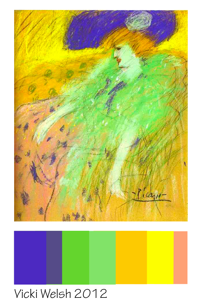
July's Color Palette Challenge is based on a Picasso painting:

I'm not the world's biggest fan of blue, but this deep cobalt is appealing. I decided to make a mini-quilt based on the Metropolis Quilt from Elizabeth Hartman's book Modern Patchwork. This is made from nine strips, which only took a few minutes to cut:

"Woven Tic Tac Toe" (19.5 x 19.5), from "Metropolis" pattern by Elizabeth Hartman.
Sew, slash, sew, repeat...fast, easy, and a great woven effect! Both of my boys saw this and said, "Wow, I love that pattern!" (but then hedged their enthusiasm with "of course I hate the colors"). They did agree, however, that the colors matched the printed photo of the painting. I did a nice tight square meander, a scrappy binding, and voilĂ ! Done in one evening, and with two full weeks left in July!