
I had to commit to one of the colors this time, so I chose dark, dusty brownish purples. For some reason, I have a lot of scrap chunks in this color. "Purple" is, in my opinion, a nearly meaningless descriptor; fabrics that are loosely defined as "purple" never seem to look good with other purples; red-violet and blue-violet are completely different beasts, and I wanted neither for this project. I made a few sample geese just to check the coordination, and the fabrics I had pulled out looked very nice with the light tan backgrounds.
The rows of teeny geese look fantastic all laid out next to each other.
 |
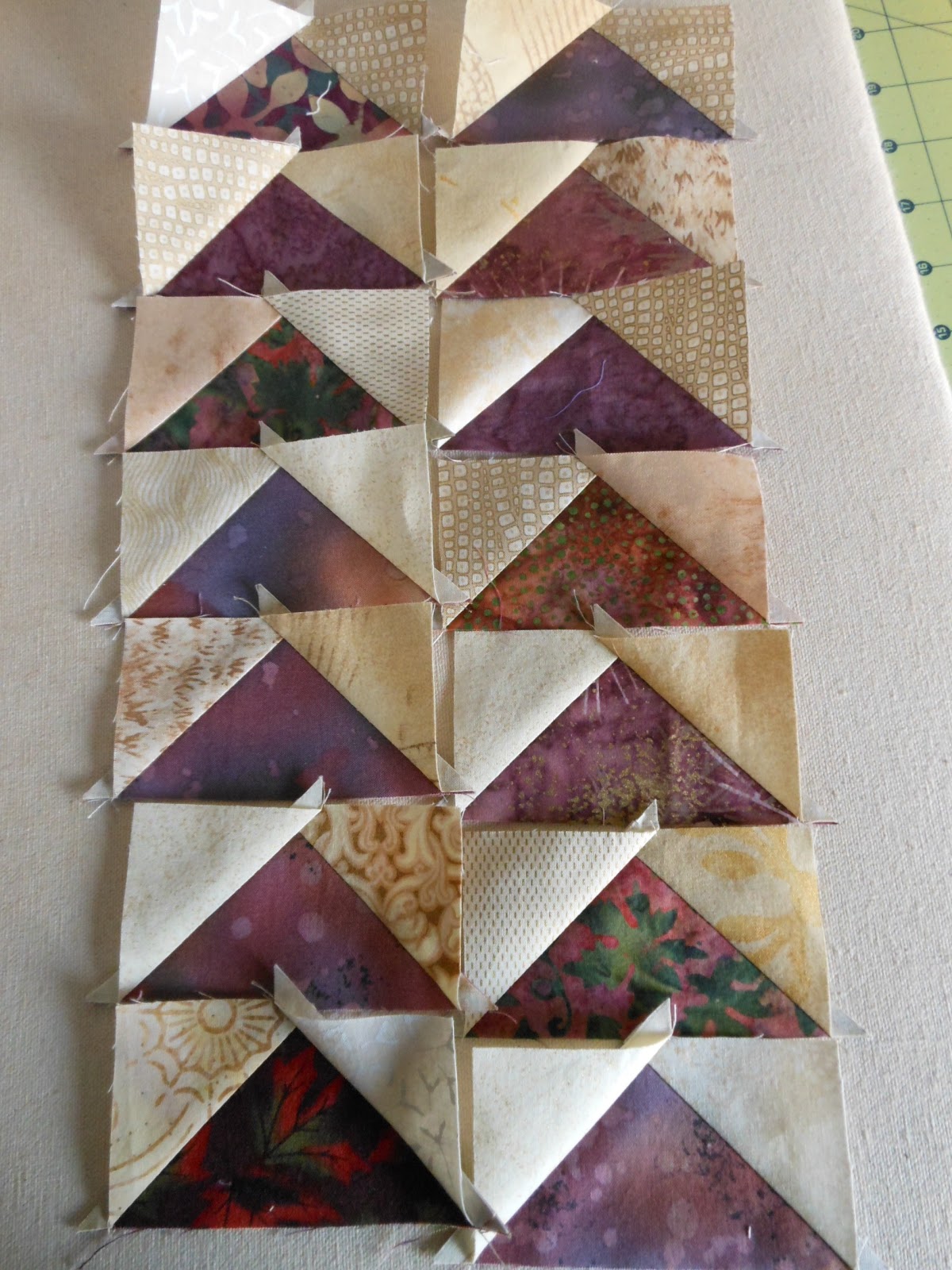
| These aren't trimmed down yet, but I wanted to take a few photos before the sun set so I could use natural light. |
When I put a few of the four-patches next to the geese, it started to have kind of a warm, rich, wine-country feel:

In terms of color selection, I'm playing this project by ear (wait...my ear can't pick color...I'm not on some weird quilting acid trip). Let me try that again: I'm letting the process determine the colors, and at this point I have a Tuscan countryside color scheme in mind. I'm thinking the next (main) colors will have to be deep olivey green, and a very dark gold/rusty orange. I usually work in brighter, more vibrant color, but I'm already starting to fall in love with my mental vision of this emerging project.
 |
| Photo completely lifted from the website of Roberto Carli, a photographer I don''t know, but who takes amazingly beautiful pictures. |
It's going to be beautiful. I can see your vision!
ReplyDeleteJudy
Niceeee!!! Well done!
ReplyDeleteThe geese look beautiful and lovely next to the 4-patches.
ReplyDeleteLookin Good!
ReplyDeleteWhen it comes to color, trusting your ear looks like a good way to go! I'm excited to see this come together.
ReplyDelete